VISUAL IDENTITY: Redskins Rebrand
A distinct timeless visual identity is a collection of visible elements that not only differentiate, but rather create truly enthusiastic and memorable responses from your audience.
NAME that invokes positive feelings & loyalty
LOGO that identifies your brand instantly
TYPOGRAPHY that sets a tone and cultivates brand recognition
BRAND COLORS that are functional and appropriate to evoke your desired perception
IMAGERY like illustrations, photography, and video that breath life into your brand and gives it personality
BRAND NAME
Invoke positive feelings & loyalty
Taa·muh·haaks
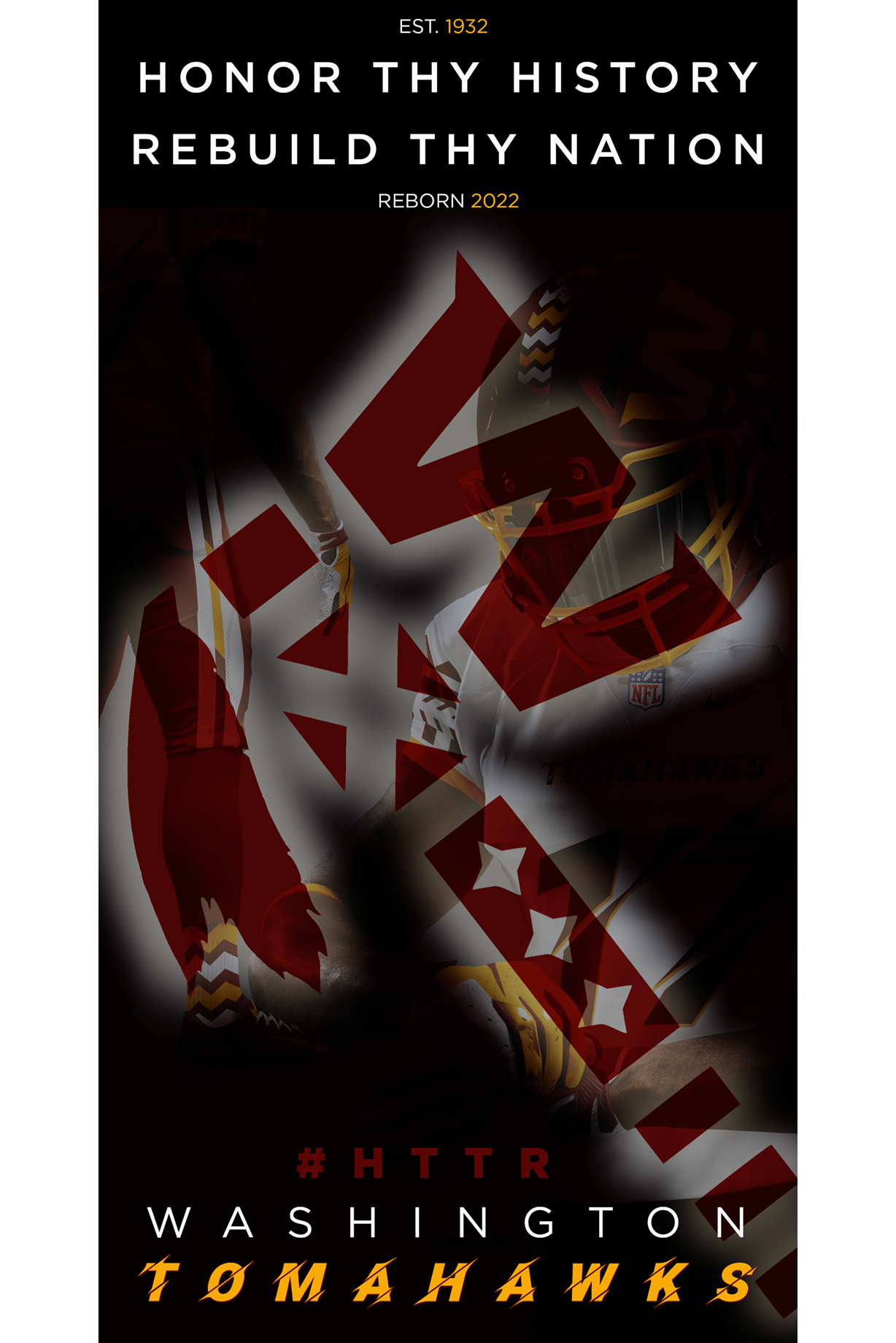
The name "TOMAHAWKS" is a bold, authentic expression that summons the rich cultural heritage of Native Americans through the lens of this versatile tool and weapon.
The tomahawk was an essential tool for hunting and chopping, as well as a deadly weapon in close combat due to its small size and maneuverability. Decorated with personal touches such as eagle feathers to impart bravery and turquoise stonework for strength and protection, the tomahawk was also a ceremonial object used in times of both war and peace. When painted red and raised by a war chief, it could incite warriors to battle, while burying the tomahawk in a ceremony symbolized the end of hostilities and the resolution of conflicts between warring tribes.
With its deep historical and cultural significance, the name "TOMAHAWKS" would undoubtedly inspire loyalty and support from both older and newer Washington Football Team fans.
BRAND LOGO
Identify your brand instantly
The TOMAHAWKS logo is a simple yet striking design that unifies the evolution of a cherished past icon with a familiar current icon to create one dynamic, forward-looking image that will resonate with fans and followers alike.
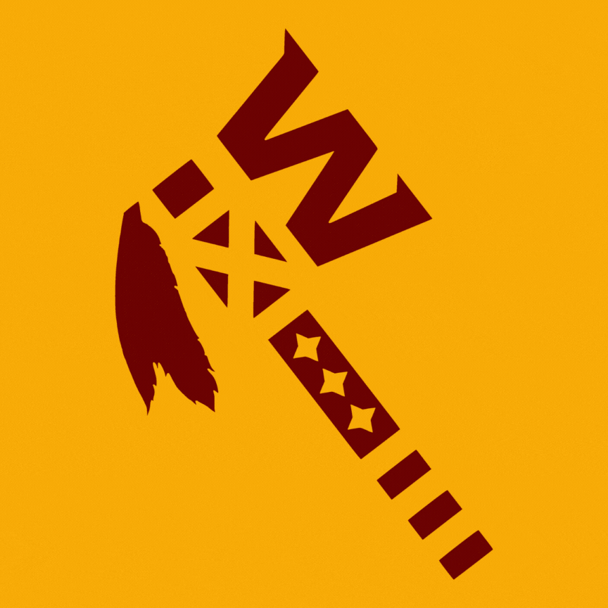
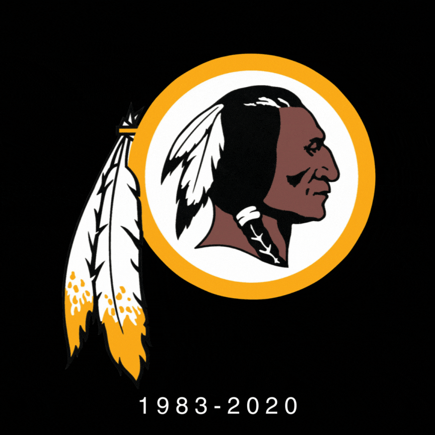
The FEATHERS on the back of the Tomahawk serve a dual purpose: they symbolize bravery in Native American culture while also honoring the team's most victorious years with feathers from the 1983 logo.
The W ICON, taken from the Washington Football Team era, forms the blade of the weapon and represents a powerful symbol of the franchise's rebirth, cutting forward into a bright new future.
The handle of the tomahawk is encrusted with stones in the shape of THREE STARS, a nod to the D.C. Flag as well as the "Morning Star" from Native American culture, which symbolizes hope and guidance.
TYPOGRAPHY
Set the tone and cultivate brand recognition


The TOMAHAWKS typography is fierce with sharp angles and subtle strokes that evoke the powerful and dangerous nature of the tomahawk, slicing through the letters and jersey numbers with unstoppable force.

BRAND COLORS
Functional and appropriate to evoke your desired perception

The TOMAHAWKS brand colors of “burgundy and gold” are an essential part of the franchise's identity, having been worn throughout its storied history. This unique color combination is instantly recognizable to diehard fans and changing it would risk alienating this loyal base.
BRAND IMAGERY
Illustrations, photography, and video that breathes life & gives it a personality
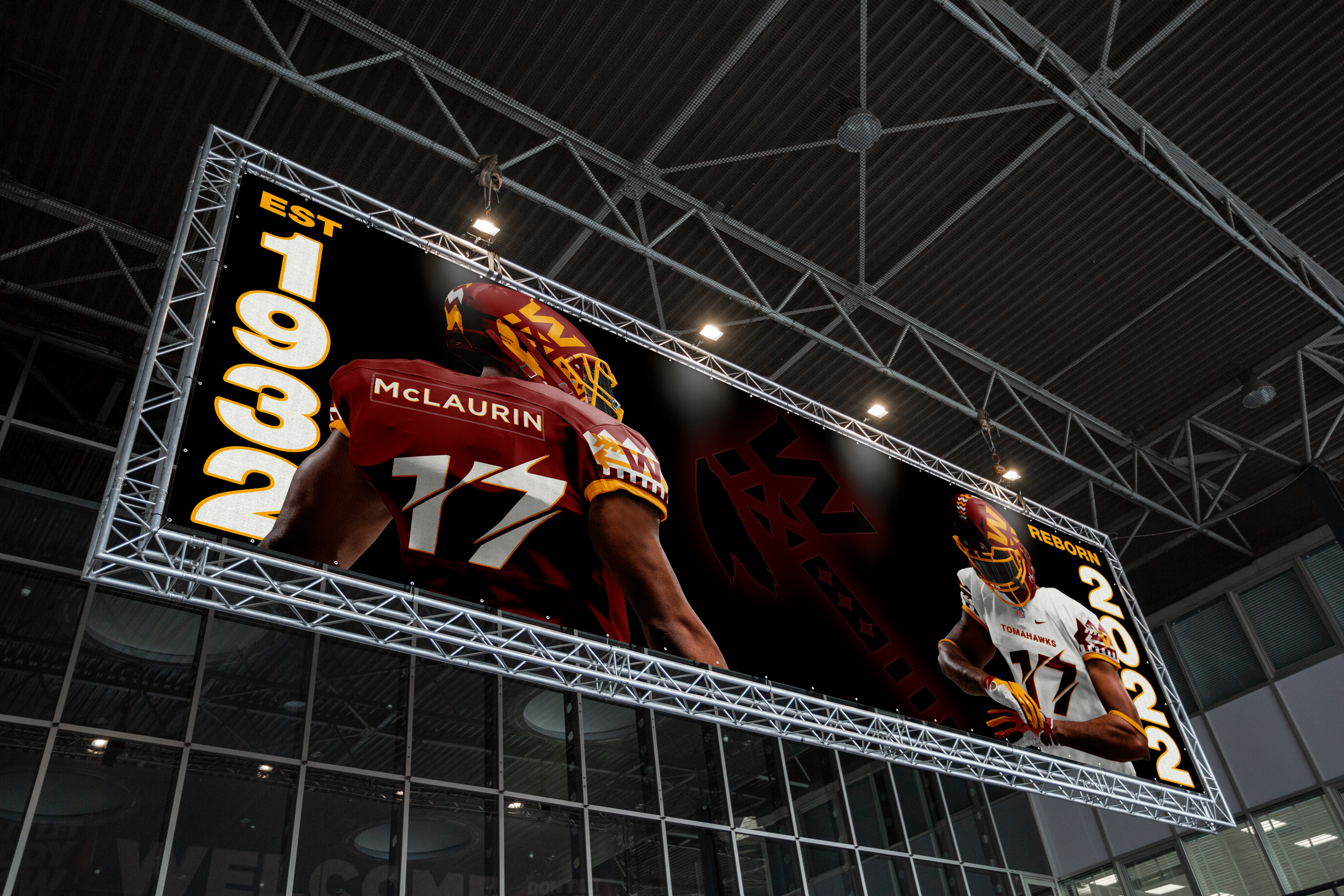
The TOMAHAWKS imagery creates a dynamic visual statement that is brought to life in their versatile emblematic jersey design, which seamlessly blends the historic team colors with powerful rich symbols of Native American heritage.
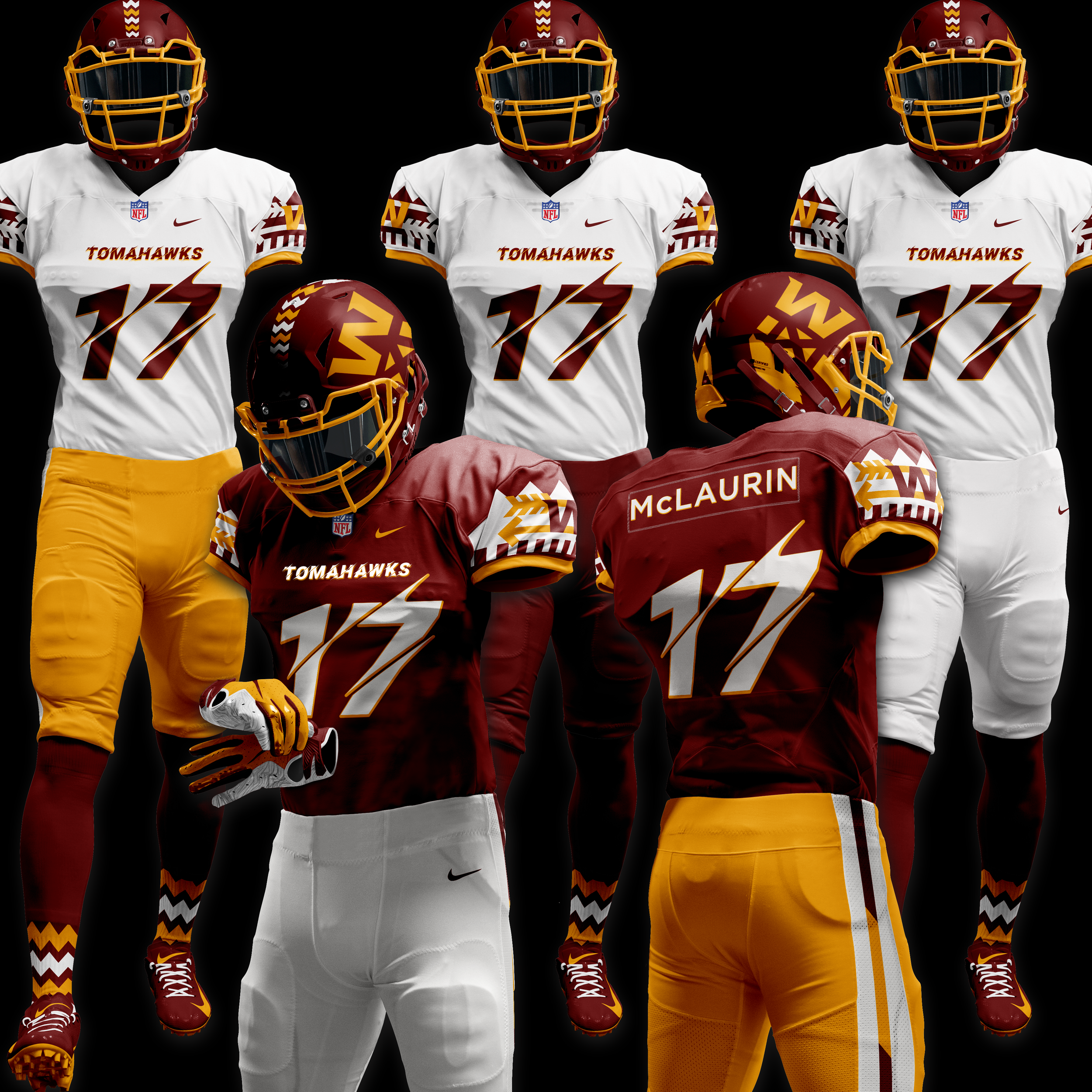
The TOMAHAWKS uniform colors offer an INCREDIBLE RANGE OF HARMONIOUS COLOR COMIBINATIONS using only Burgundy, Gold, and White. With 12 clean and coordinated options that include two colored helmets, two colored jerseys, and three colored pants, their versatility sets it apart from other teams and creates powerful visual impact on the field. In contrast, the current Commanders uniforms lack the mix-and-match options and are limited to just three choices.

The SHOULDER DESIGN features the recent "W" icon from the Football Team era, set against a backdrop of two arrows and a forest of trees. In Native American culture, ARROWS symbolize protection and defense, while the forest of trees is made up of two additional symbols: SPRING, representing the franchise's rebirth, and a FENCE, evoking good luck in this process.

The ZIGZAG DESIGN found on the Tomahawks helmet and socks is more than just a tribal pattern. The "red zigzag" represents traditional war paint that gives warriors strength and speed in battle, while the "thicker double zigzags" depict a mountain range, reminding the organization of the challenging journey ahead.

The TOMAHAWKS merchandise would depict the same Native American symbolic jersey design elements and motifs to strengthen the rebrand.

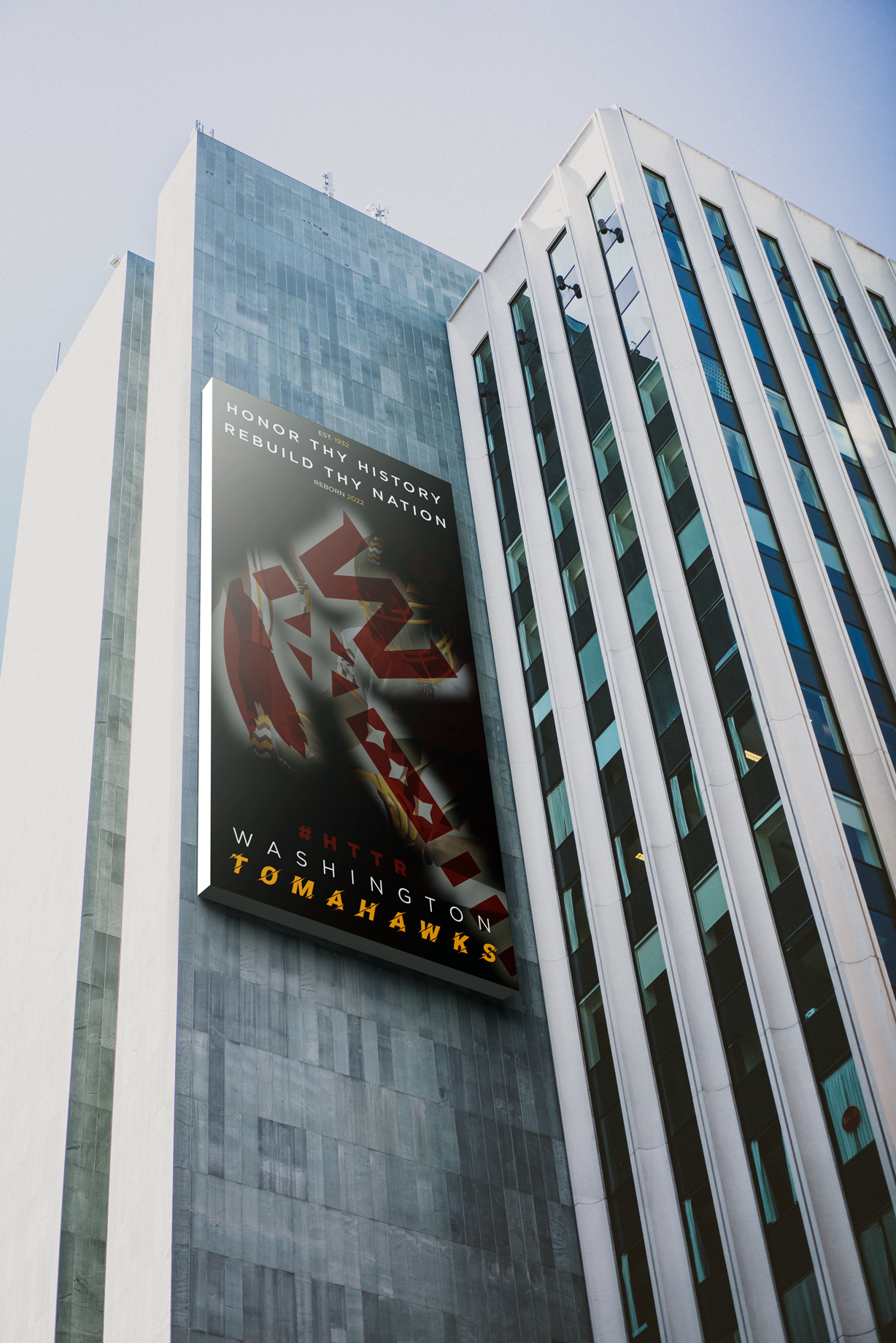
The TOMAHAWKS promotional campaign "Honor Thy History, Rebuild Thy Nation" acknowledges the football team's history and founding in 1932 while recognizing past mistakes and embracing a new beginning. The campaign aims to regenerate excitement for the franchise using the slogan “Honor thy History, Rebuild thy Nation” and keeps the beloved hashtag #HTTR but updates the meaning to "Hunt Thy Treacherous Rivals."

With Acknowledgement that culture is not a monolith and there is no universal agreement among Native American communities on the appropriateness of the name Tomahawks. However, steps could be made for a successful reincarnation with wide and far reaching support to occur.
For instance, substantial financial contributions as well as scholarships and grants could be awarded to Native American communities and tribes. Furthermore, a partnership with the National Museum of the American Indian could be established to create educational awareness of the history and current situations of Native American Tribes.
BACKGROUND
The Rebrand of the Washington (Redskins) Football Team was a two year process that promised to include fan collaboration and transparency, but akin to the decades of Synder’s failed ownership, it was a tremendous disappointment.
Here are the lowlights of the botched rebrand and main visual identity missteps.
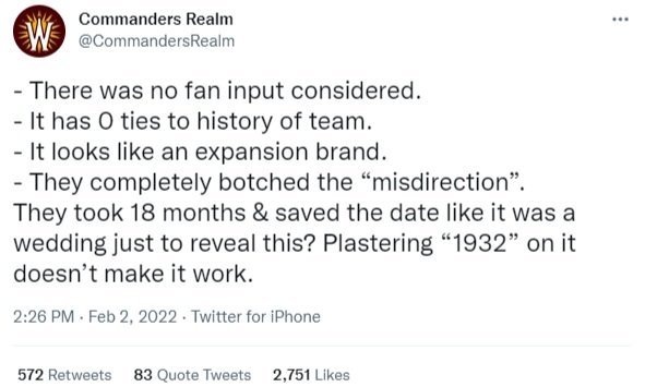
The strong NAME favorites (“Redwolves” or “Redtails”) by multiple fan polls were ignored and substituted with a stolen name and hashtag from the San Antonio Commanders, a now defunct Alliance of American Football Team.

The EMBLEM LOGO crest which is worn as a patch on the uniforms, from a design standpoint is not scalable (illegible from a distance and is too complicated to appreciate). Furthermore, it embarrassingly lists the Super Bowl winning seasons (1982, 1987, and 1991) incorrectly, as it features the years that The Super Bowls were played.

The highly anticipated release of the NEW UNIFORMS unveiled bland and generic designs with few distinguishing marks that celebrate the new name or the team’s location or history. Another design oversight is the lack of consistency and conformity between the three uniforms, which appear to be from different teams entirely (most apparent in the white jersey that confusingly uses non team colors of red and black) and cannot be mixed or matched to make seamless exciting combinations throughout the season.
